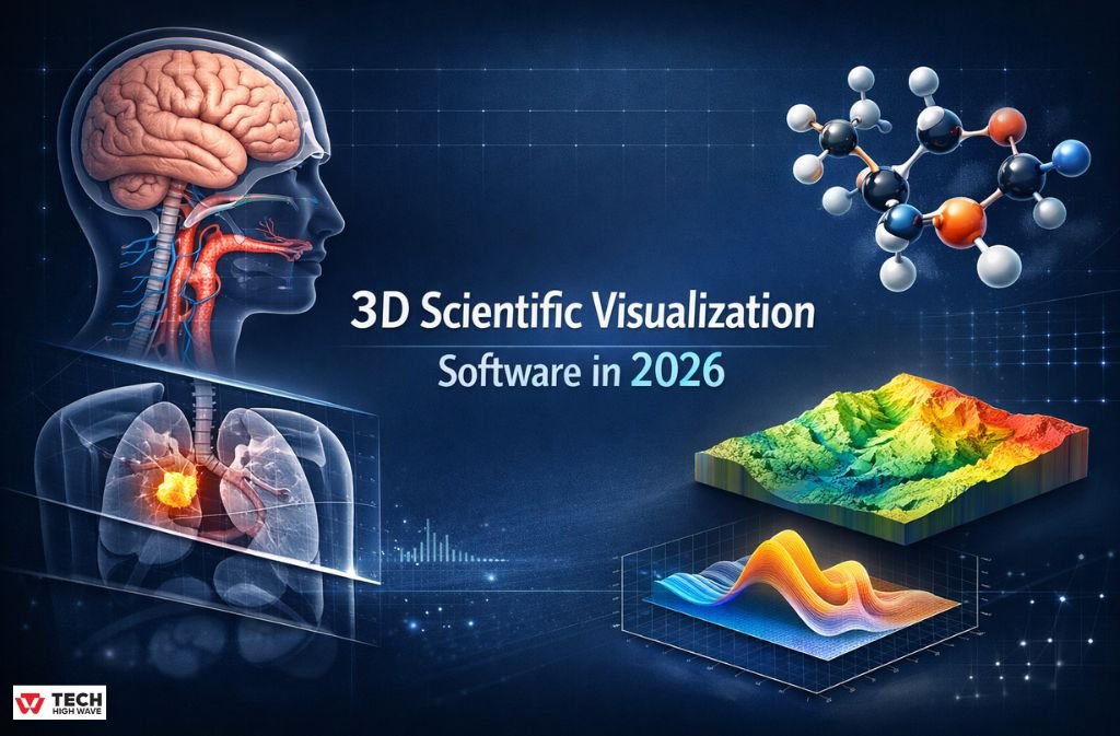
Most searches for software for 3D scientific visualization start the same way: something simply isn’t translating well on screen.
At first, a chart feels flat.
Then, a diagram looks acceptable but still fails to explain anything meaningful.
Eventually, a reviewer asks for “clearer structure,” and suddenly it’s unclear what needs fixing—or how.
By this point, that frustration is common. Scientific work has steadily outgrown 2D visuals across many fields. Data sets are larger, systems are more layered, and collaboration increasingly happens between people who don’t share the same technical background. As a result, when spatial relationships matter, moving into three dimensions isn’t a nice-to-have anymore—it’s a practical requirement.
For that reason, this article avoids shiny features and marketing language. Instead, it focuses on how 3D scientific software actually behaves in day-to-day research, and where tools like BioRender, Blender, and 3D Slicer genuinely fit once real workflows are involved.
What “Software for 3D Scientific Visualization” Really Means
In practice, this term covers tools that turn scientific information into three-dimensional representations that can be explored, checked, and reused.
The important word here is scientific.
These tools aren’t built to impress. They’re built to preserve scale, structure, and relationships. If a molecule bends, a tissue layer, or a field shifts over time, the software should show that without interpretation getting in the way.
You’ll see this type of software used in:
- biomedical and clinical research
- engineering and physics simulations
- chemistry and molecular studies
- environmental and climate modeling
- teaching complex systems visually
The value isn’t aesthetics. It’s clarity.
How 3D Scientific Visualization Software Is Typically Used
Despite different interfaces, most workflows look similar once you strip them down.
Data comes in first. That might be medical imaging, simulation output, lab measurements, or structured files.
Then the software translates that data into a 3D form. Sometimes it’s a surface, or a volume, or sometimes something in between. What matters is that proportions and relationships stay intact.
After that, visualization tools come into play. Color maps, transparency, slicing, and rotation. Not to decorate, but to reveal what’s already there.
Finally, the output. A figure for a paper. An interactive view for exploration. A model shared with collaborators. The best tools don’t force you to choose just one.
Essential Features for Effective 3D Scientific Visualization Software in 2026
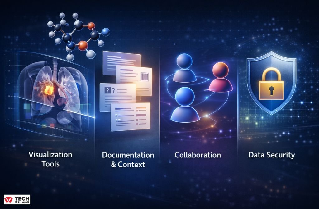
Visualization Tools
In real research work, useful visualization usually includes:
- volume or surface rendering
- cross-sections you can control
- scalar values mapped clearly
- the ability to view change over time
If a tool can’t do these well, fancy UI elements won’t save it.
Documentation and Context
This part is easy to overlook until it’s missing.
Good software lets you keep notes with the model. What dataset was used. What assumptions were made. Why a threshold was chosen. Without this, revisiting work later becomes guesswork.
Reproducibility isn’t just about code. It’s about context.
Collaboration
Sharing still breaks a lot of workflows.
Some tools make it easy to pass visuals around. Others technically allow it, but only after awkward exports and explanations. If collaboration matters in your environment, this difference shows up quickly.
Data Security
For medical and institutional research, security often decides everything.
Local processing. Controlled access. Clear data ownership. These aren’t bonus features. They’re requirements.
Also Read: Car Key Programmer Software 2026: What Actually Works, What Doesn’t, and What to Buy
Where 3D Scientific Visualization Is Most Useful
These tools earn their keep when spatial understanding changes interpretation.
A few common examples:
- examining anatomical structures from scans
- Understanding molecular interactions
- exploring stress, flow, or field behavior
- teaching concepts that are hard to imagine flat
In these cases, 3D visualization doesn’t just explain results. It often changes them.
Who Actually Uses This Software
It’s rarely just one group.
You’ll find:
- researchers and graduate students
- clinicians working with imaging data
- scientific illustrators
- engineers
- educators
Anyone who needs to explain structure, depth, or movement ends up here sooner or later.
BioRender vs Blender vs 3D Slicer (Without Marketing Spin)
Big-Picture Comparison
| Aspect | BioRender | Blender | 3D Slicer |
| Main Purpose | Scientific figures | General 3D creation | Scientific & medical data |
| Typical Output | Graphical abstracts | Custom visuals & animation | Volumetric analysis |
| Learning Curve | Short | Long | Moderate |
| Scientific Accuracy | Conceptual | Depends on setup | High |
| Cost | Paid | Free | Free |
What They’re Like to Use
| Capability | BioRender | Blender | 3D Slicer |
| Volume Rendering | No | Possible, not native | Core feature |
| Segmentation | No | Manual | Advanced |
| Animation | Very limited | Excellent | Minimal |
| Data Formats | Few | Many (generic) | Scientific & medical |
| Customization | Template-driven | Almost unlimited | High, but focused |
Honest Strengths and Weaknesses
| Tool | Works Well For | Struggles With |
| BioRender | Fast publication figures | Real data analysis |
| Blender | Full creative control | Time and complexity |
| 3D Slicer | Accurate scientific visuals | Presentation polish |
In practice, teams often mix tools rather than commit to one.
Choosing the Right Tool (Without Overthinking It)
A simple way to decide:
You mostly need clean figures quickly, BioRender is efficient.
If you need custom visuals or animations that don’t exist yet, Blender gives freedom—at the cost of time.
If your work starts with imaging data or volumetric measurements, 3D Slicer usually makes the most sense.
The wrong choice isn’t catastrophic. But it will slow you down.
Mistakes That Keep Showing Up
A few patterns repeat across labs and teams:
- picking tools because they look impressive
- adding detail where clarity matters more
- forgetting how a model was generated
- not thinking ahead about sharing
These mistakes don’t show immediately. They surface during revisions.
Where This Is Headed in 2026
Quiet changes matter more than flashy ones.
AI-assisted preprocessing is becoming normal. Browser-based visualization is improving. Collaboration is getting closer to real time. Visualization is moving earlier in the research process instead of sitting at the end.
That shift changes how people work.
FAQs
Q.1 What is the best software for 3D scientific visualization?
There isn’t a single best option. It depends on whether you need figures, custom visuals, or direct interaction with scientific data.
Q.2 Can free software be used professionally?
Yes. Blender and 3D Slicer are widely used in academic and clinical environments, though they require more setup.
Q.3 Are journals okay with 3D visuals?
They are, as long as visuals are accurate, clearly labeled, and exported correctly.
Q.4 Do I need programming skills?
Not strictly. But scripting helps once workflows become repetitive or complex.
Q.5 How accurate are these visualizations?
Accuracy depends on the data and the tool. Software built for scientific use preserves scale and relationships by design.
Final Note
Choosing software for 3D scientific visualization isn’t about trends. It’s about whether a tool respects your data and fits how you actually work.When it does, visualization stops being a presentation step and becomes part of thinking itself.
Also check: How to Update ETSJavaApp by eTrueSports in 2026 (Fix Crashes & Missing Features)